Lecture Note Week 4
Learning Objective:
Be able to use visual principles such as preattentive attributes and the data-ink ratio to enhance chart design.
Be able to create and use PivotTables and PivotCharts in Power BI to explore and analyze data.
Be able to create and interpret scatter charts, line charts, bar charts, and column charts to examine relationships between variables.
Be able to create and interpret advanced visualizations such as trendlines, sorted/clustered/stacked bar charts, bubble charts, scatter chart matrices, and table lenses.
Be able to design and create effective data dashboards in Power BI for real-time data analysis and decision-making.
Data Visualization with Power BI
1. PivotTables
Purpose:
PivotTables: Summarize, analyze, explore, and present summary data.
PivotCharts: Visualize the data from PivotTables.
Creating PivotTables in Power BI:
Import Data: Load your dataset into Power BI.
Go to
Home > Get Data > Excel(or choose your data source).Select your file and click
Load.
Create PivotTable:
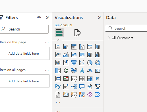
- Go to
Visualization > Build Visual > Choose Table.
- Go to
Visualize Data:
Drag fields into Rows, Columns, and Values areas in the Visualizations pane.
Adjust the fields to refine your table.
2. Scatter Charts
Purpose: Examine relationships between two variables.
Creating Scatter Charts in Power BI:
Select Scatter Chart:
Go to the
Visualizationspane.Click on the Scatter Chart icon.
Add Data Fields:
Drag numerical fields to the X-axis and Y-axis.
Optionally, add a third numerical field to the
Sizefield well.
Customize and Interpret:
Use the
Formatpane to customize the chart’s appearance.Interpret the relationship between variables by examining the pattern of points.
3. Line Charts, Bar Charts, and Column Charts
Purpose:
Line Charts: Show trends over time.
Bar Charts: Compare quantities across categories.
Column Charts: Similar to bar charts, but vertical.
Creating Line Charts in Power BI:
Select Line Chart:
Go to the
Visualizationspane.Click on the Line Chart icon.
Add Data Fields:
- Drag a date field to the X-axis and a numerical field to the Y-axis.
Creating Bar and Column Charts in Power BI:
Select Bar/Column Chart:
Go to the
Visualizationspane.Click on the Bar Chart or Column Chart icon.
Add Data Fields:
- Drag a categorical field to the Axis area and a numerical field to the Values area.
4. Sorted, Clustered, and Stacked Bar (Column) Charts
Purpose:
Sorted Bar/Column Charts: Rank data in ascending or descending order.
Clustered Bar/Column Charts: Compare multiple categories across a single axis.
Stacked Bar/Column Charts: Show composition and compare totals.
Creating Sorted Bar/Column Charts:
Sort Data:
Click on the ellipsis (…) in the top right corner of the chart.
Select
Sort axisand choose the desired field.
Creating Clustered Bar/Column Charts:
Select Clustered Chart:
Go to the
Visualizationspane.Click on the Clustered Bar Chart or Clustered Column Chart icon.
Add Data Fields:
- Drag multiple categorical fields to the Axis area and a numerical field to the Values area.
Creating Stacked Bar/Column Charts:
Select Stacked Chart:
Go to the
Visualizationspane.Click on the Stacked Bar Chart or Stacked Column Chart icon.
Add Data Fields:
- Drag a categorical field to the Axis area and another categorical field to the Legend area.
5. Bubble Charts
Purpose:
- Bubble Charts: Visualize three dimensions of data.
Creating Bubble Charts in Power BI:
Select Bubble Chart:
Go to the
Visualizationspane.Click on the Scatter Chart icon and add a field to the
Sizewell.
Add Data Fields:
- Drag fields to the X-axis, Y-axis, and Size areas.
6. Advanced Visualization Types
Purpose:
Heat Maps: Show data density or intensity.
Sparklines: Show trends in a small space.
Treemaps: Visualize hierarchical data.
Waterfall Charts: Show cumulative effects.
Stock Charts: Display financial data.
Parallel Coordinates Plots: Visualize multi-dimensional data.
Creating Heat Maps in Power BI:
Select Heat Map:
- Use the Shape Map visual in the
Visualizationspane.
- Use the Shape Map visual in the
Add Data Fields:
- Drag fields to the Location and Value areas.
Creating Sparklines in Power BI:
Add Sparklines:
Go to
Visualizationspane.Use the
Line and clustered column chartvisual.
Add Data Fields:
- Drag fields to the Line Values area.
Creating Treemaps in Power BI:
Select Treemap:
Go to the
Visualizationspane.Click on the Treemap icon.
Add Data Fields:
- Drag hierarchical fields to the Group and Values areas.
Creating Waterfall Charts in Power BI:
Select Waterfall Chart:
Go to the
Visualizationspane.Click on the Waterfall Chart icon.
Add Data Fields:
- Drag fields to the Category and Y-axis areas.
7. Geospatial Data Visualization
Purpose:
Choropleth Maps: Visualize data across geographical regions.
Cartograms: Distort map shapes to represent data values.
Creating Choropleth Maps in Power BI:
Select Map:
Go to the
Visualizationspane.Click on the Map or Filled Map icon.
Add Data Fields:
- Drag geographical fields to the Location area and data fields to the Values area.
Data Visualization with R
1. Introduction to Base Plotting in R
Base R provides a powerful system for creating a wide range of visualizations without the need for additional packages. While ggplot2 and other libraries have gained popularity, base plotting remains an essential tool due to its simplicity, speed, and integration with the rest of R’s functionality.
2. Basic Plot Types
Scatter Plot (
plot)- The
plot()function is versatile and can create different types of plots depending on the input data. It’s most commonly used for scatter plots.
- The
Line Plot (
plotwith type = “l”)- Setting
type = "l"in theplot()function produces a line plot.
- Setting
Histogram (
hist)- The
hist()function creates a histogram, useful for visualizing the distribution of a dataset.
- The
Boxplot (
boxplot)- The
boxplot()function provides a visualization of the distribution of data across different categories.
- The
Barplot (
barplot)- The
barplot()function is used to create bar charts.
- The
3. Customizing Plots
Titles and Labels
- You can add titles, axis labels, and customize them using
main,xlab, andylabarguments.
- You can add titles, axis labels, and customize them using
Colors and Point Types
- Customize the appearance of points and lines using arguments like
col,pch, andlty.
- Customize the appearance of points and lines using arguments like
Multiple Plots
- You can create multiple plots in a single window using
par(mfrow = c(nrows, ncols)).
- You can create multiple plots in a single window using
Legends
- Add legends using the
legend()function to describe different elements in your plot.
- Add legends using the
4. Advanced Customizations
Plot Annotations
- Use
text()to add text annotations to your plots.
- Use
Axes Customization
- You can control axis limits, labels, and ticks using
xlim,ylim,axes = FALSE, andaxis().
- You can control axis limits, labels, and ticks using
Adding Gridlines
- Use the
grid()function to add gridlines to a plot.
- Use the
5. Saving Plots
Saving to File
- Use functions like
pdf(),png(),jpeg(), etc., to save plots to files.
- Use functions like
6. Conclusion
Base R plotting is a flexible and powerful tool for creating a wide range of visualizations. While it may lack the more advanced features of libraries like ggplot2, its simplicity and speed make it an essential tool for quick data exploration and visualization.